


Product: Native iOS app
My Role: UX Research and Design, UI design Student project
Participants involved: 60+
Year: 2018
The Challenge:
Studying is hard. While information is readily available, finding knowledgeable, trustworthy support can be difficult. Education can be expensive and is rarely tailor made for individuals. Learning in large groups presents issues with scheduling. This prevent many students from achieving their desired educational goals. Design a solution that helps.
Proposed solution
Liftoff is an app which allows students to connect with supportive tutors. Tutors are readily available at various price points and cover a large range of topics in an easy to access native iOS app.
The Process: Discovery> Ideate>Test>Refine
Discovery
Method: Competitive Analysis
Apart from free resources such as Google or Quora, main competitors identified were Class Gap and Varsity Tutors. I researched the following areas to create SWOT profiles. Overall strategies, market advantages, marketing profiles, key objectives.

Aim: Deliver a polished product to compete with Class Gap before more competitors moved in. Offer qualified tutors with flexibility for students.

Method: User and Job stories
To better empathise with the audience, User and Job Stories were created to represent some of the real world need the students would have. Having these in mind helped to anchor the designs and offer relevant solutions.
We are not building for ourselves, but for the target audience. These stories helped to anchor the designs to user needs.
“As a potential student, I want to browse prices and subjects before I sign up, so that I can tell if I’m likely to use the app.”
“When I’m looking for a tutor, I want to narrow down my search quickly, so that I’m not wasting time looking at tutors I’ll never use.”
Method: Surveys and interviews
Up to this point, I did not have much direct research to fuel my assumptions. So I created a survey with Typeform to understand some of the motivating factors that my audience had, and what experiences they had had with previous tutors. I was looking for pain points, but also apps they commonly used. After this preliminary research, I interviewed 5 participants to focus more on the qualitative information that couldn’t be gleaned from the surveys.
A round of affinity mapping helped to make sense of common themes including:


- Students learn and retain significantly more from tutors that are engaging and supportive
- Students are efficient at online research but want help with technical subjects
- Students expect rapid scheduling and one click payment flows
- Interviewees were overwhelmingly Apple users
Ideate
With this information a Problem Statement was defined. I would focus on creating the app from the perspective of the student user.
“Students need an intuitive platform to receive tutor support because close guidance helps to keep them accountable in their studies.”
Method: User Personas
Drawing heavily from the surveys and interviews, User Personas were created to represent some common traits that would be useful to keep in mind when the ideation phase began. Welcome Miley- the millennial and Rikki- the family upskiller.


Method: Journey Maps and Mental models
While having two distinct personas with varying needs helped to conceive of the scope, I still wanted to identify opportunities along the journey where the students could be supported better. Mapping out the User Journeys helped with this.


Method: Mental models
To dive a little deeper into the mindset of the user, I created mental models as a way to explore the relationship users had to learning online or asking for help.


Method: Card sorts
At this point I had a lot of ideas for what content I wanted to include but I wanted to make sure I was on the right track with how to make connections with the Information Architecture. I invited 8 participants to an open card sort which left me a little frustrated as it was fairly inconclusive.
In a second round with new participants, a closed card sort with predefined titles helped me to appreciate that what was intuitive for me, was not intuitive for all. Suggested titles seemed to work well for the majority so I kept these in mind for the IA.
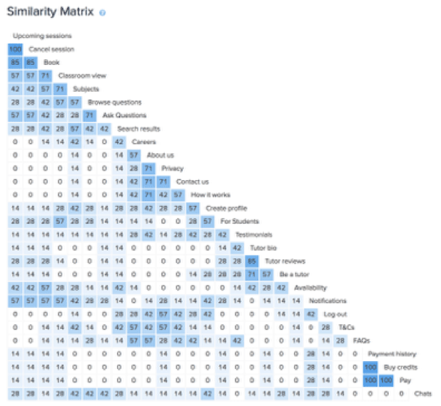

Method: Information architecture
The original sitemap included both signed in and signed out versions of the app, from both student and tutor views. However, this was pretty ambitious for an MVP.
I decided to focus on the student perspective as a foundation and build out from there. While the Tutor version was just as important, it would include additional information such as profile setup, screening for qualifications and payment options.
As the target demographic predominantly used Apple products, I decided to go straight to a native iOS app to start.

Method: user flows
It’s no good designing screen after screen without having a clear sense of direction. If the IA was the bones of this blueprint, mapping out the user flows helped to flesh out my ideas before diving into the first wireframes. Starting out with some of the more important features, the main focus was to have the user complete the flow as smoothly and as quickly as possible.


Method: Wireframes
Wireframing is a whole lot of fun, the danger is in spending too long trying to perfect things. I knew that the more time I spent on them more more biased I would be. For the low fidelity wireframes, pulling out a sharpie that doesn’t allow for excessive details helped me to not get too precious about the initial design and come up with multiple solutions.


Mid-Fidelity Wireframes were then created in Balsamiq which furthered the designs and also helped to tweak basic elements of each screen. Digitizing the wireframes exposed areas that were too content-heavy or that were missing navigational elements.

Getting to work on the design solutions in high-fidelity wireframes exposed some unanticipated weaknesses.
For instance, the original search filter options included ratings. However, I didn’t want to exclude tutors that were new or had a bad review (sometimes this can’t be helped), so I removed the option to search by rating specifically and just showed the ratings in the results page.
Also the option for languages was moved to the profile page for students, this would be more of a universal language setting unless the student was hoping to learn a new language, in which case it would be a subject. This information would default to the users phone preference and be available in settings to change if they wanted.
These options cluttered the screen unnecessarily and once taken away, reduced the cognitive load for the user.

Test
Method: Usability Testing
Seven testers were asked to complete 3 task flows and asked the level of difficulty, and observed closely as they moved through each task. After the test, they were sent a short System Usability Scale (SUS) questionnaire for further quantitative data which would help to highlight additional frustration/satisfaction.
The errors were rated according to Jakob Nielsen’s 5 Components of Usability. The top 5 issues were prioritised according to the impact on task completion and time it would take to adjust in the next iteration.

Method: A/B Testing
Before choosing the look and feel of the app, I wanted to see what appealed to our target demographic more successfully. Using a Sign up screen for the basis, two different screens were created for a preference test on Usability Hub. 25 Testers participated and a clear preference for the blue design emerged as users found this version:


-Professional and easier to view
-More trustworthy and confident
-CTA had more contrast and stood out more
With twice as many testers validating the first choice, the wireframes were all updated to include the new colour scheme.
Refine
notes on: interface iteration
Now it was time to tidy up some of the visual aspects. A 12 column grid was applied so that eventually, these designs would be scalable for different platforms. The following screens show some early improvements:
Screen 1 -This was one of the more memorable screens for users and helped to subtly display the product brand. The hot air balloon was given an opaque fill for better emphasis. The opacity for the clouds was also reduced.

Screen 2 -Testers loved the illustrations but they weren’t uniform with the rest of the app. Swatches were taken from the primary gradient and applied so that the screens had a more consistent look.

Screen 3 - Similar information grouped together, adjusted the font hierarchy and updated the background colour. This reduced complexity and harmonized the information.

Method: style guides
Instead of coming up with unique approaches to each page, a Style Guide was created as a touch point to help audit and replace the elements throughout the 50+ pages. Symbols were created and general guidelines established. This document could now be maintained and shared to save endless hours on design decisions for myself and any future collaborators.

Icons -freepic.com/smashicons.com/iconfinder.com/goodware/icons54.com
Photos - Unsplash.com
Illustrations - all-free-download.com
notes on: Accessibility
Recognising the diversity of our target demographic, it was important to make the platform as accessible and inclusive as possible. With this in mind, further refinements were made to include static titles, enhance text contrast, and revisit text hierarchy throughout the app.
Here you can see the progression of the Sign up screen:


The Invision prototype was updated and shared with peers for further testing. I was curious to see what had been missed. With feedback from 10 gracious peers asked to test 4 different user flows, there was quite a bit. These were sorted into positive, neutral and negative critiques. The negative and neutral comments were addressed and either justified, or the prototype was updated to include the feedback. The positive feedback let me know what resonated with people.
Here is where the project ended:

While I didn’t always come up with the best solution, it was exciting to collaborate with others and incorporate this feedback into the design. Curious to see how it works?
Feel free to play around with the prototype:
And here’s a short promotional video I made wrap things up.
Reflections
With additional time and resources, I would love to take this prototype even further as a native iOS app. I spent too much time trying to create something from scratch without using known familiar patterns which lost me a lot of unnecessary time.
What I most enjoyed about this project was tapping into some great feedback from users which help me to navigate the waters ahead. I learned how to question my assumptions and stay open-minded and receptive to receiving constructive criticism as this really helped to push me further.